



Usability Critique of The Wimbledon Website :
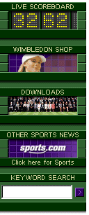
A very well organized site built by IBM. Color combination is in harmony with the Mecca of Tennis. The live scorecard applet is very functional -- what's up with the 3262 on graphic though? The full-text search, navigation, and the quality of information are all very good.
I wish that they did not restrict the contents to a width of 600 pixels...
Instead of seperating the teasor and the link to the full story, why don't they just hyperlink the story title?
Wimbledon 2001